Full Spectrum
An outdated ’90s townhouse is given a colorful modern makeover, creating a space for art and chic accents — not to mention the husband!

"My husband’s clothes were on rolling racks!” exclaims Jan Bartholomew of hubby Dave Wood, who took up residence in his then brand-new wife’s Tanglewood home after they were married a few years ago. “There is no space for the man when he moves in after a woman has lived there for a few years.” The 50-something couple, who both work in finance, knew they’d need to renovate or relocate, to make the shared space work for both of them. They spent nearly two years searching for a new place, but nothing on the market appealed to them. They decided to bite the bullet and remodel their existing home.
Built in 1998, the townhouse was still in great shape — but in serious need of a modern makeover. Little natural light, sectioned-off rooms and no open-concept living space made it feel very ’90s, which didn’t at all appeal to Bartholomew’s evolved contemporary tastes. “I saw an article on Eklektik Interiors in a magazine and called firm designer Kathy Anderson to set up an interview,” Bartholomew says. “We connected our first visit, and she helped me visualize an open space downstairs by moving a few walls.
“Of course, as remodels go, that is all we intended to do,” adds the homeowner with a wistful smile. The scope of the job would soon grow.
Anderson worked with Bartholomew to create a plan to give the townhouse the flow and natural light the homeowners wanted. The couple moved into an 800-square-foot apartment so they could be out of the way for what they hoped would be a quick remodel. “As the project evolved, so did the ideas and additional renovation,” Bartholomew explains. By the time it was all said and done, they had fully gutted and remodeled the entire house.
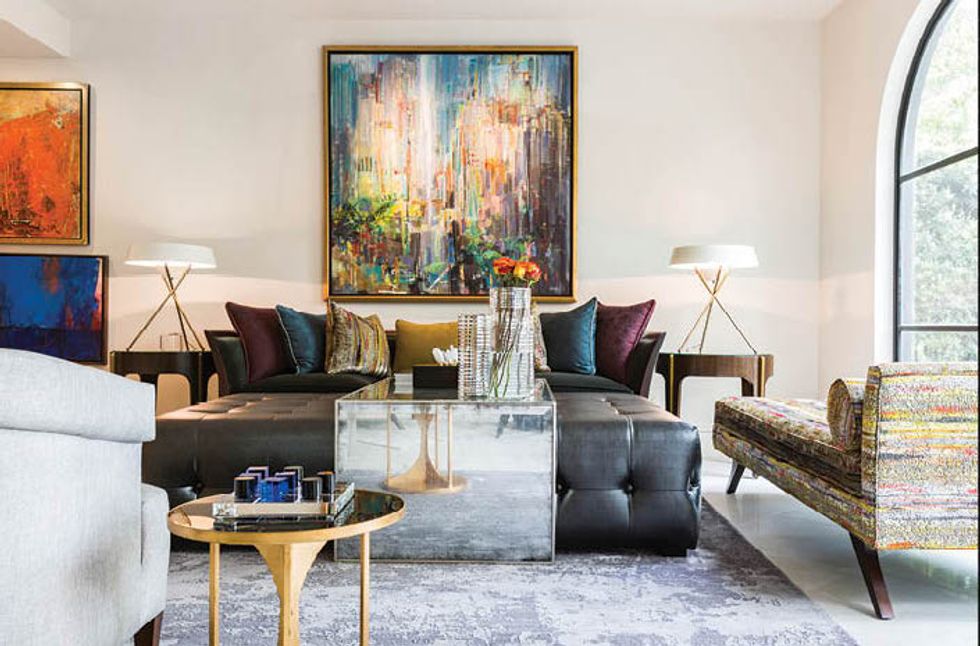
“They wanted people to walk in and be blown away,” Anderson says. And indeed, the “swanky, sexy and sophisticated” look, as the designer describes it, hits you at the door. A decadent malachite, gold and green lacquer Christopher Guy mirror hanging in the entry gives way to a large curving stairway that drives your eyes up to catch just a glimpse of the chandelier dangling from above. “The chandeliers in the house are jewelry for the ceiling; they weren’t meant to be the focal point,” Anderson says. “Everything was about highlighting their art collection,” which ranges from traditional oil-on-canvas landscapes to contemporary multimedia pieces with metallic effects, the majority of which were purchased by the couple on their many globe-trotting vacations. Adds Anderson, “Even the fabrics we used were meant to make the art pop.”
The Theodore Alexander chaise next to the fireplace is the best testament to Bartholomew’s approach to color: the deeper and more saturated, the better. Upholstered in a purple, teal and yellow fabric from Fabric Hut, the chaise faces what was once a solid wall. “We left the fireplace as it was,” says Anderson, “but we opened up the walls around it.” What resulted is natural light pouring in from both sides of the open space through the large picture windows.
“The entire downstairs is one of our new favorite places in our home,” Bartholomew says. “We have a pool in the front yard, and now the entire downstairs is open and the outside appears to be inside. It is so open, bright and classy.”
The home had an elevator that didn’t go all the way up to the third floor, so they had it removed, and also closed up a few existing archways that looked into the dining room to make room for wine storage. There’s a floating Murano glass wall outside the wine space that divides the dining room from the living room. “We all fell in love with it,” says the designer. “It was crazy expensive, but we wanted it in there. I placed a small table with chairs in front of the Murano wall so there was a place to sit that was not formal — but it also serves to protect the glass from someone walking into it!”
Bartholomew notes that hers and Anderson’s tastes in décor are “very similar,” and that the process of selecting furniture was “fun and rewarding.” “We have acquired many unique pieces that we actually love,” Bartholomew says. “And my husband is so relieved to have his own space in our closet, and no longer fears his rolling racks my be rolled to the driveway some day!”
ABOVE: The living room includes colorful touches like a multicolor chaise to accentuate the art.


